Written by
Jeremy Hickman
Jeremy Hickman, WordPress Website Designer 310
310
310
310
Read it in 5 minutes
Topics
About the author
Jeremy Hickman is a freelance Web Designer and WordPress expert from West Sussex in the UK. With over 20 years' experience as a web designer, he also has a good level of development, marketing and SEO knowledge across both WordPress and HubSpot platforms.
Follow Jeremy Hickman on InstagramResponsive Web Design (RWD) emerged in 2010 as an approach to web design that allows a web page to adapt to a variety of devices or screen sizes. The goal of RWD techniques is to allow the website to present its content in an optimal way for usability and appearance regardless of the size of the screen it is displayed on.
Responsive Web Design became more important as the adoption of smartphones became widespread. Smartphones had smaller screens than the previously-favoured desktop or laptop computers. The users of these devices soon became the majority of all website visitors.
Traditional web page layouts didn’t fit smartphone displays which were typically portrait in orientation and narrow. Responsive Web Design allows the web designer to offer different page layouts to suit these new screen sizes. In 2015 Google started to boost the ranking of mobile-friendly websites in its search results, in a decision dubbed ‘Mobilegeddon’.
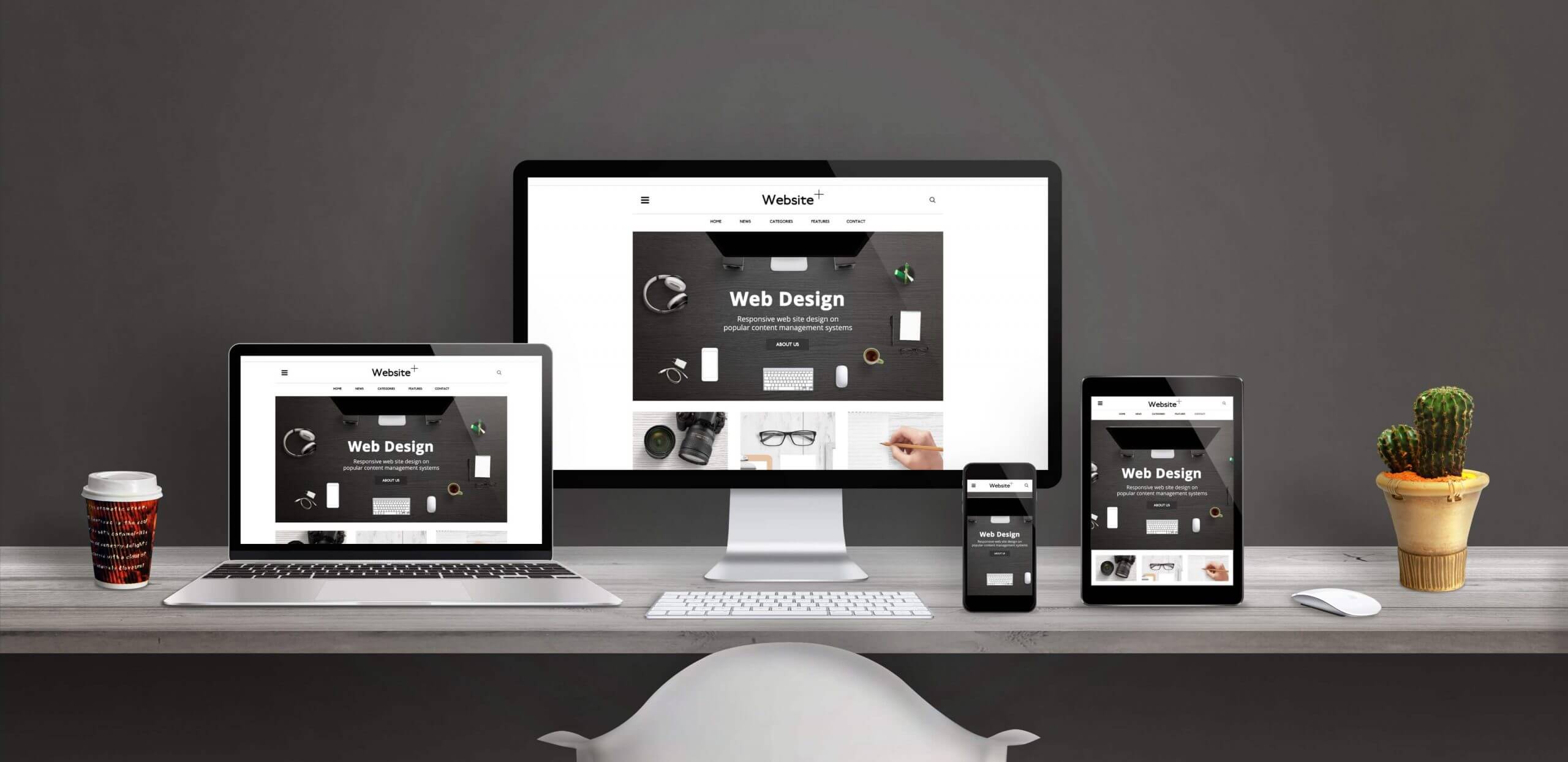
Responsive Web Design is device agnostic
Today, there is a huge range of devices on the market today with different screen sizes and resolutions. Some are landscape, some are portrait, and others are square. Many can switch from portrait to landscape depending on the way the device is held by the user. The iPhone and iPad are good examples of such devices.
This presents a challenge for the web designer. However, techniques such as flexible or fluid grids have become a popular way to create responsive websites. These grids use relative units or percentages to specify their proportions rather than absolute units such as pixels. Combined with CSS media queries these layouts can adapt to smaller screen sizes. This means the web designer doesn’t need to create separate designs for every device on the market. This makes today’s responsive websites device-agnostic.
Who benefits from Responsive Web Design?
A responsive website will benefit all users and improve their user experience (UX). The web designer and developer will benefit as they can build one site which works on a range of devices. This is far more economical and efficient than developing separate sites to suit each specific device.
Responsive Web Design improves the experience of all users that browse websites on their mobile devices. This applies whether the user is browsing for pleasure, shopping, banking or for business. As of 2024 over 60% or website traffic comes from mobile devices. Over 92% of users consider accessing the internet on their smartphones compared to other devices 1.
With this level of mobile traffic it is easy to see why Responsive Web Design is an essential technique today. Search engines such as Google now favour websites that are mobile-friendly, responsive, and fast to load in their search results.
What elements are required for Responsive Web Design?
- HTML (Hypertext Markup Language)
This is the language a web page is written in, and determines the content and structure of the page. - CSS (Cascading Style Sheets)
This is a programming language that determines the design of a web page a web page written in HTML - Media Queries
A the part of CSS that allows the developer to specify different designs and layouts depending on the screen size the user is viewing the page on. - Flexible grids or fluid layouts
Provide for a content layout (specified in relative units) which can adapt to fit different screen or browser widths.
How does Responsive Web Design work?
When written with RWD in mind, Cascading Style Sheets (CSS) provide for different settings and styling properties depending on the user’s screen size, orientation, resolution or other characteristics. One of the most common CSS properties related to RWD are viewport and media queries.
Mobile-first design
Your web designer should work on a mobile-first approach. This is important now that Google and other search engines place so much emphasis on websites which are mobile optimised.
A mobile-first approach means that the designer will consider how the website will look on a mobile device in the first instance. They will then use progressive enhancements to alter the design and layout as space progressively increases on larger screen sizes.
Ideally the website content will be the same across all devices. Early websites developed for mobile devices presented an abridged version of the page with some content omitted. Today, we should show the mobile user all of the content. The page design should make this content easily accessible by the user, given the available screen space. As screen size increases on different devices, the layout can adapt to present the same content in an appropriate way for the additional space available.
The mobile-first approach to Responsive Web Design contrasts to the former graceful degradation approach. This method meant the website was developed for larger screens first, without consideration for mobile. As page elements stopped working on mobile devices, techniques were employed to allow the site to continue to function without the failing elements. This generally gave mobile users an inferior experience to their desktop counterparts. With the high level of traffic coming from mobile devices today, the mobile-first approach is essential.
How can I tell if my website is responsive?
It is possible to quickly see if your website is responsive:
- Open your website in Google Chrome.
command+alt+ito open Developer Toolscommand+shift+mto toggle the Device Toolbar- Choose a device to view your page from a mobile, tablet or desktop perspective
You will be able to see how your website looks on a simulation of a wide variety of devices.
You may find that your website isn’t responsive or that it gives a poor experience on mobile devices.
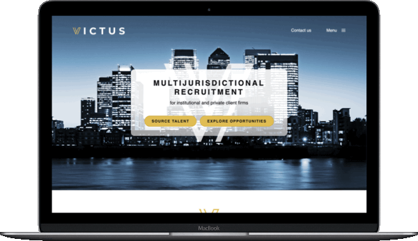
Even if your current site is built with Responsive Web Design techniques many weren’t designed on a mobile-first basis. This means that mobile users weren’t considered as the priority. In this case you will almost certainly benefit from a website redesign. Contact me today to discuss your options, and request a no-obligation initial discussion.